Lecture 1: Affordances Link to heading
Good Affordance – The Login Screen in Genshin Impact Link to heading
The login screen of Genshin Impact is a good example of affordance in a digital interface. A large door is placed at the center of the screen, directly in front of the player. A door naturally suggests the action of entering or passing through it. At the same time, the text “Click to Begin” (点击进入 in the Chinese version) explicitly tells the user how to perform this action.
When the player clicks, the door opens and the camera moves through it into the game. Therefore, the visual metaphor and the actual interaction are consistent: the door suggests “enter”, the text suggests “click”, and clicking the screen allows the player to enter the game.
This design is intuitive because the user can understand both what will happen and what action is required before interacting with the interface.
The door itself provides a conceptual affordance, while “Click to Begin” acts more precisely as a signifier. The door communicates “I can enter”, while the text communicates “this is how I enter”.

Figure 1. The login screen of Genshin Impact. The central door and the “Click to Begin” instruction clearly indicate how the player can enter the game.
Bad Affordance – Language Selection in Love and Deepspace Link to heading
The language setting in the Chinese version of Love and Deepspace is an example of bad affordance. The current language, “Simplified Chinese”, is displayed inside a dropdown menu with a downward arrow. This visual design suggests that the user can open the menu and choose from multiple language options.
However, when the dropdown menu is opened, the only available option is still “Simplified Chinese”. Therefore, although the interface visually affords language selection, no actual choice is available. The dropdown arrow creates an expectation of interaction that the system cannot fulfil.
This can cause unnecessary interaction and confusion. A user may open the menu expecting to find other languages, only to discover that there is nothing to select.
Redesign: If only one interface language is available in this version of the game, “Simplified Chinese” should be displayed as static text rather than as a dropdown menu. Alternatively, the control could be disabled and accompanied by a short message such as “Only Simplified Chinese is available in this version.” If additional languages become available in the future, the dropdown menu can then be enabled.
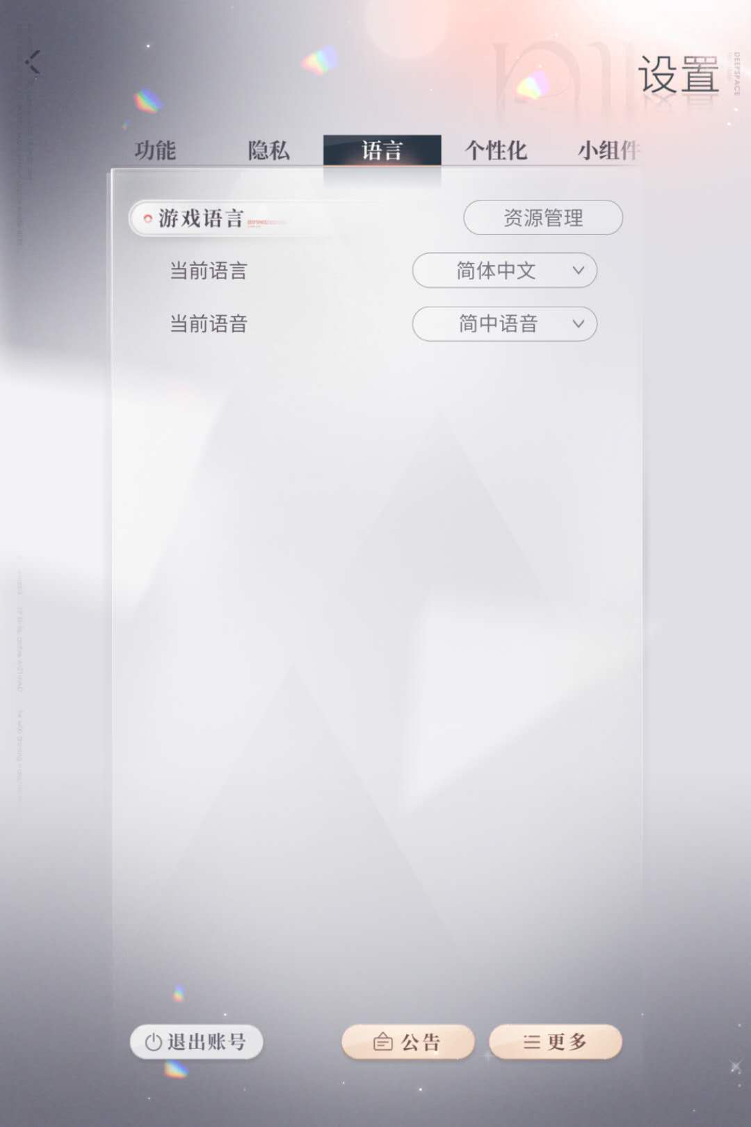
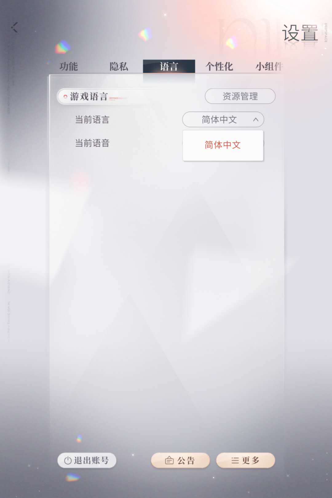
Figure 2. The language setting appears as a dropdown menu, suggesting that multiple languages can be selected.
Figure 3. After opening the dropdown menu, “Simplified Chinese” is the only available option.
Lecture 2: Gestalt Laws Link to heading
Gestalt Law Case 1 – Figure–Ground: Visual Occlusion in Arknights Link to heading
This example from Arknights illustrates a problem with the Gestalt principle of Figure–Ground. In a strategy game, operators, enemies, HP bars, and important status information should normally function as the figure, while decorative skill effects should remain in the ground.
In this screenshot, the skill effect of the operator Horn produces a very bright visual effect over a large area. The effect partially obscures the enemy and overlaps with other important visual information, including HP bars, damage numbers, status icons, and nearby operators. As a result, the distinction between gameplay-relevant objects and secondary visual effects becomes weaker.
Experienced players may still understand the situation through their knowledge of operator positions, enemies, and game mechanics. However, the visual effect introduces unnecessary visual occlusion and makes important information more difficult to identify quickly, especially when several effects occur simultaneously.
Redesign: The game could reduce the brightness or opacity of skill effects when they overlap with important gameplay objects. Another solution would be to keep the silhouettes, HP bars, and status indicators of operators and enemies rendered clearly above the effects. This would preserve the visual impact of the skill while improving Figure–Ground separation and the readability of combat information.

Figure 4. A bright skill effect from Horn partially obscures enemies and overlaps with other combat information, weakening the Figure–Ground distinction.
Gestalt Law Case 2 – Similarity: Elemental Damage Indicators in Arknights Link to heading
This example from Arknights illustrates a problem with the Gestalt Law of Similarity. In the game, different operators can inflict different types of elemental damage. For example, Virtuosa inflicts Necrosis Damage, while Dionysus inflicts Nervous Impairment. These are two different types of elemental damage, and their accumulation progresses independently.
However, their visual indicators on enemies are highly similar. In the screenshot, both types of elemental damage are represented by similar white circular indicators around the enemies. Because visually similar elements are naturally perceived as belonging to the same category, players may have difficulty quickly identifying which type of elemental damage is currently accumulating and how far each independent effect has progressed.
The problem becomes more noticeable when operators using different elemental damage types are deployed in the same battle. Although an experienced player may infer the damage type from the operators involved or other contextual information, the indicator itself does not provide a sufficiently clear distinction.
Redesign: Different elemental damage types could use clearly distinguishishable visual indicators. For example, each type could have its own icon, shape, or pattern in addition to color. Using multiple visual cues rather than color alone would allow players to identify the damage type quickly even during visually complex battles.

Figure 5. Necrosis Damage from Virtuosa and Nervous Impairment from Dionysus use highly similar circular visual indicators, making their independent accumulation difficult to distinguish at a glance.
Lecture 3: Dark Design Patterns Link to heading
Case 1 – Obstruction: iQIYI Auto-Renewal Cancellation Link to heading
This example shows the cancellation process for iQIYI’s automatic VIP membership renewal service. When the user chooses “Close Service”, the subscription is not cancelled immediately. Instead, another confirmation window appears and offers an additional benefit, such as 10 extra days of membership, encouraging the user to reconsider the cancellation. The user must then select “Confirm Cancellation” to continue.
This is an example of the Obstruction dark pattern, also commonly described as a Roach Motel: joining or continuing a service is made easy, while leaving the service requires additional steps. In this case, the retention offer introduces extra friction at the exact moment when the user has already expressed an intention to cancel.
Redesign: Cancelling automatic renewal should be as straightforward as enabling it. After selecting “Close Service”, the user could receive one simple confirmation dialog explaining the consequences of cancellation, with clear and neutral options such as “Confirm Cancellation” and “Keep Subscription”. Promotional rewards should not be inserted into the cancellation process in a way that distracts users from their original intention.

Figure 6. The iQIYI auto-renewal cancellation process. After choosing to close the service, the user encounters an additional retention offer before confirming the cancellation.
Case 2 – Visual Interference: Cookie Consent on Trakt Link to heading
The cookie settings interface on Trakt provides an example of Visual Interference, or False Hierarchy, in a consent interface. In the first screenshot, “Accept All” is displayed as a bright red button, while “Reject All” is displayed in a much less prominent grey button. Although both options are available on the same screen, their visual presentation is not equally prominent.
This visual hierarchy draws the user’s attention toward “Accept All” and can encourage acceptance even when the user may prefer to reject optional cookies. The problem is therefore not the availability of the choices, but the unequal visual emphasis given to them.
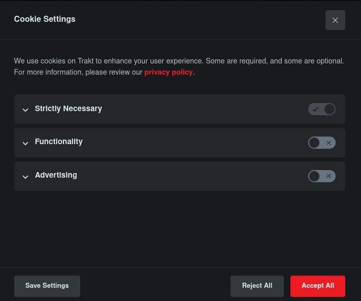
Figure 7. In the cookie settings interface, “Accept All” is visually emphasized in red while “Reject All” is shown in grey.
Redesign: “Accept All” and “Reject All” should have equal visual prominence. They should use comparable size, contrast, color, and placement so that neither option is visually preferred. The second screenshot demonstrates a better design: “Reject All” and “Accept All” are presented with the same size, color, and visual weight, while “Cookie Settings” remains available as a separate option for users who want more detailed control.

Figure 8. A more neutral design gives “Reject All” and “Accept All” equal visual prominence.